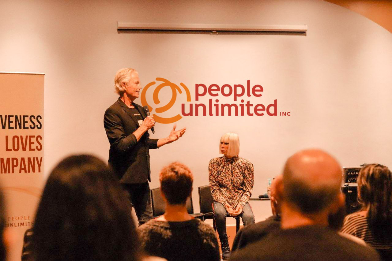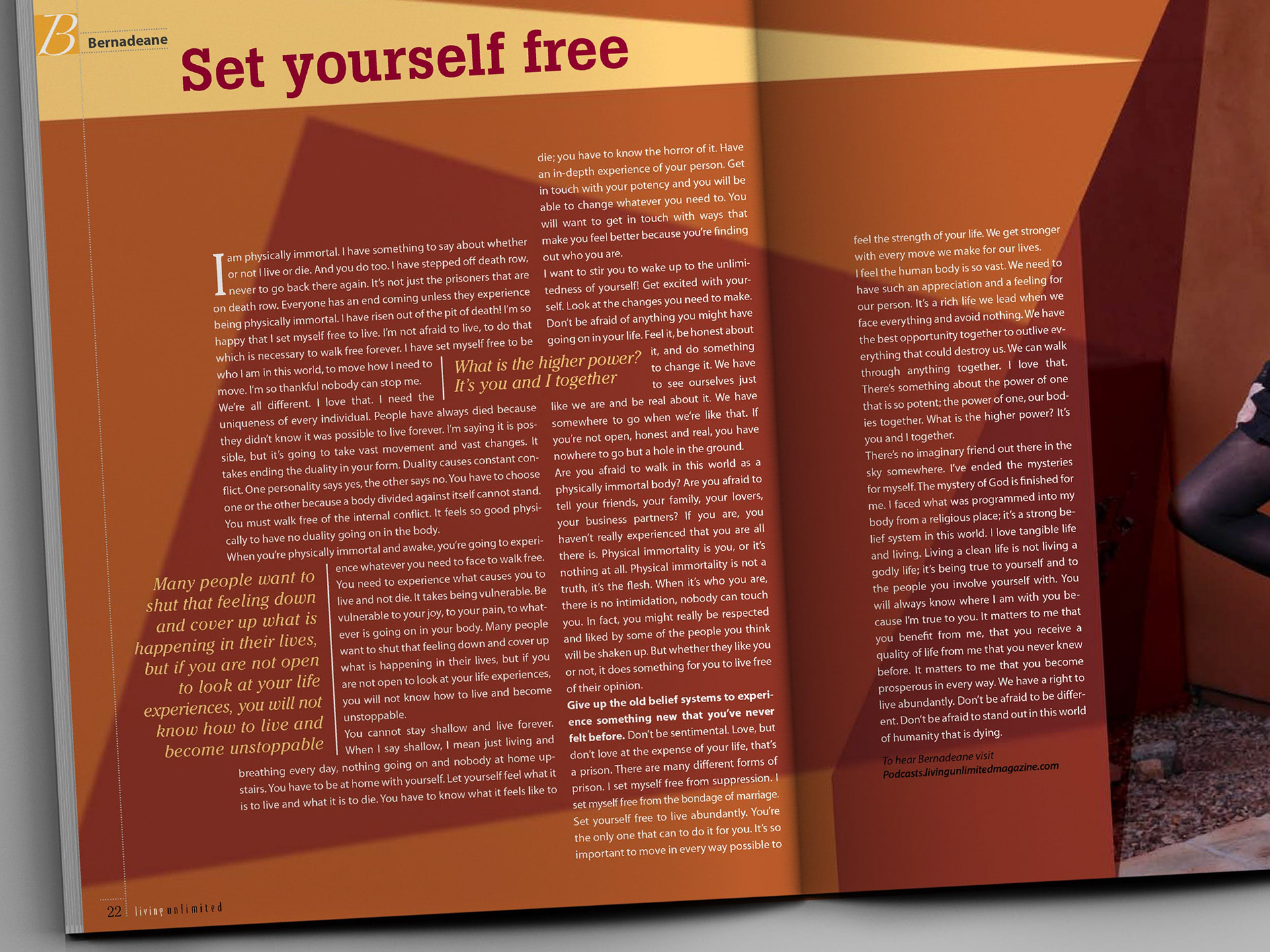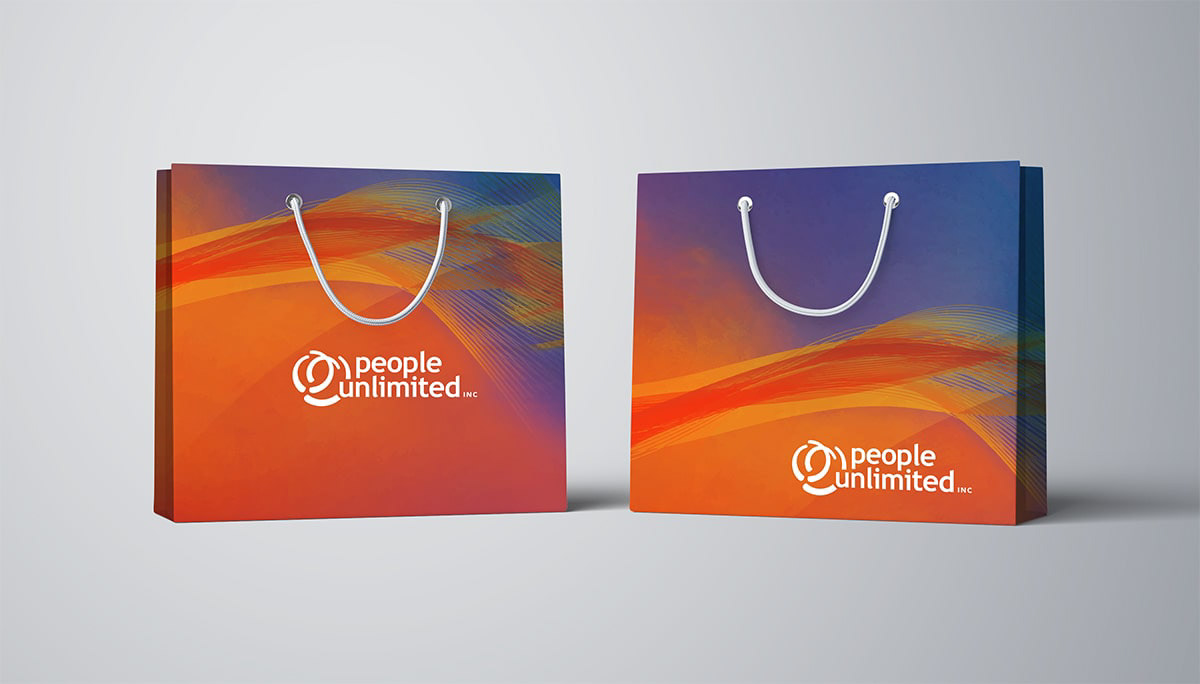

People Unlimited is an organization that provides ageless education, nourishing connection and inspiration for people that want to live a long lifespan.
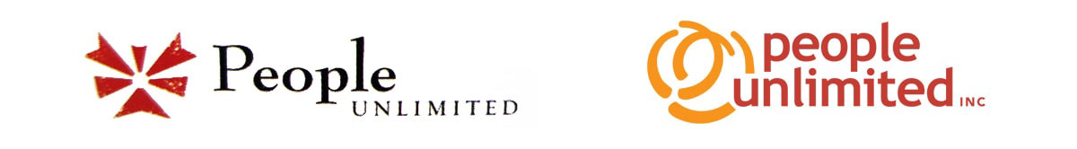
However, their old branding, with its stark lines and old-fashioned design, appeared like a logo for a religious or new-age community. While there is nothing wrong with this look, it conflicted with People Unlimited’s identity as a non-religious organization that focuses on supporting an ageless life through constant growth and transformation.
In the new logo, I chose to depict an abstract spiral in constant movement as the “conceptual base” of the overall design, symbolizing growth and progression. On top of the spiral, the company’s name in lower-case letters evokes a feeling of friendly connection with the reader, rather than the serious corporate feel of the old logo.
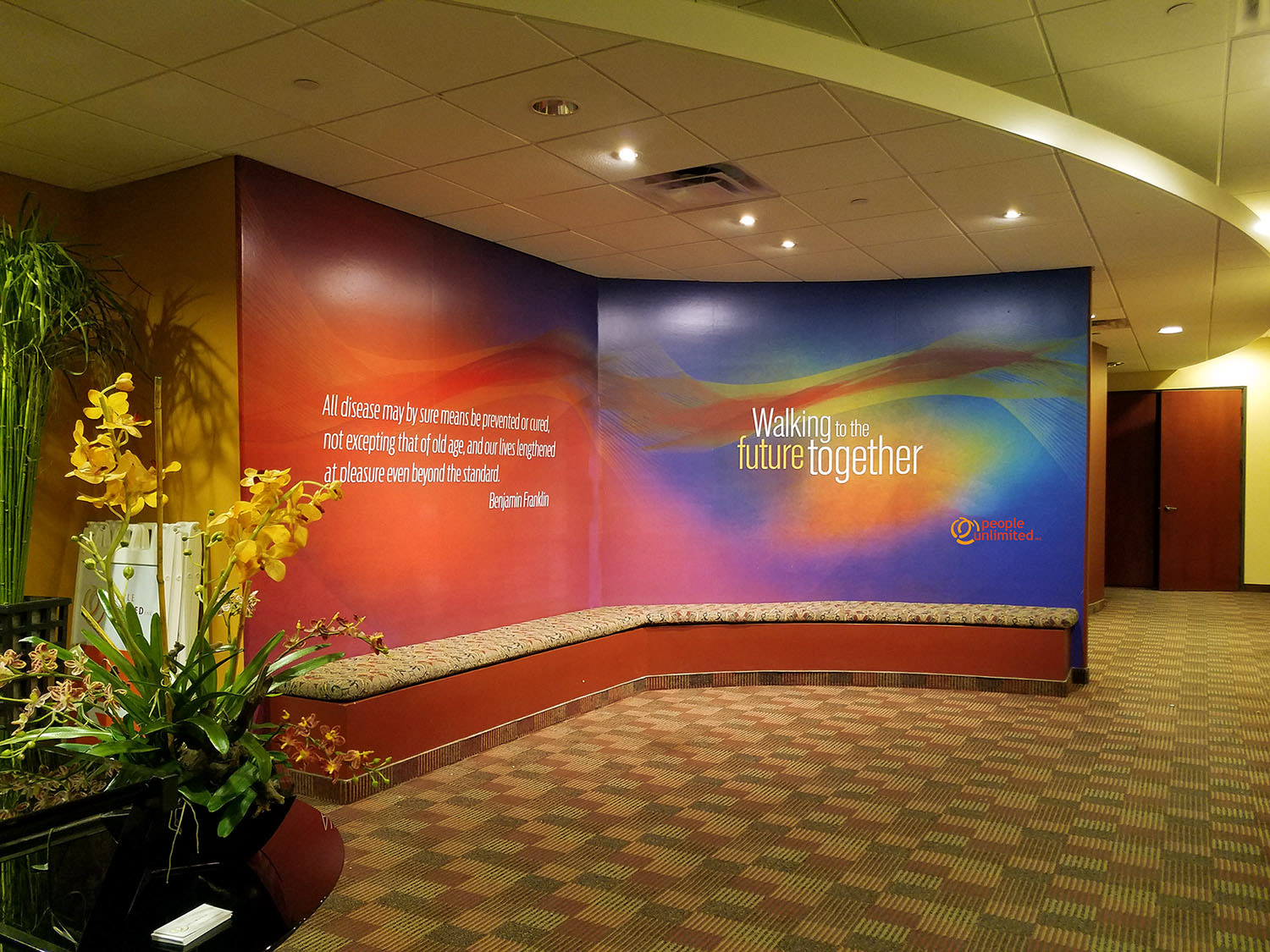
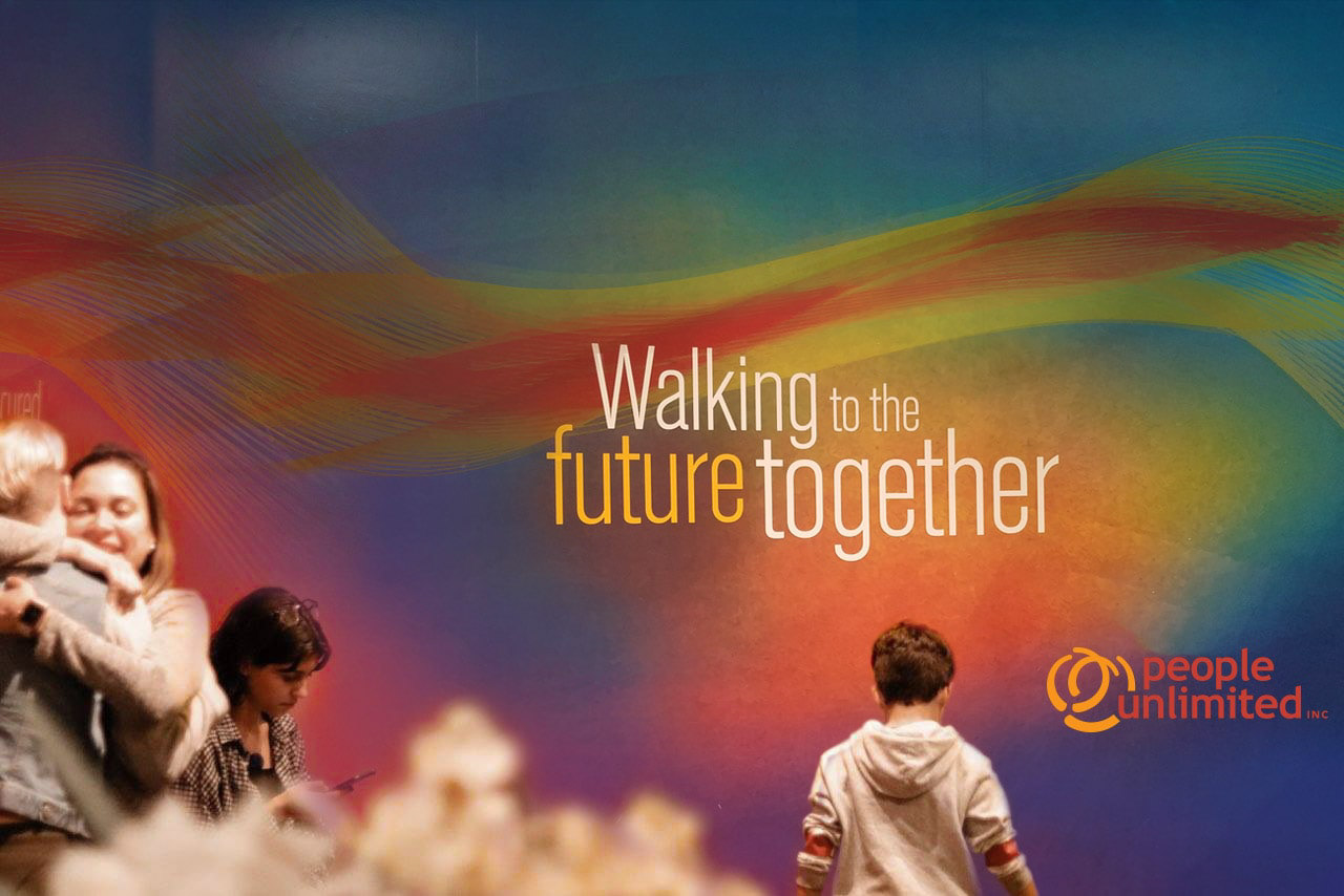
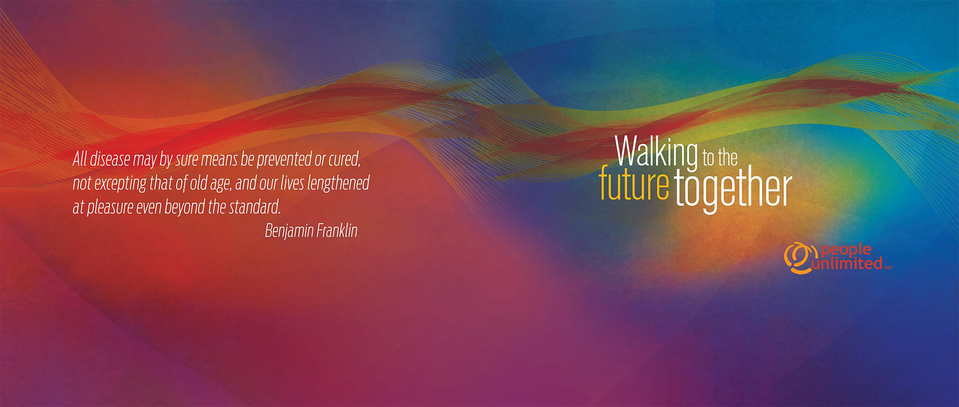
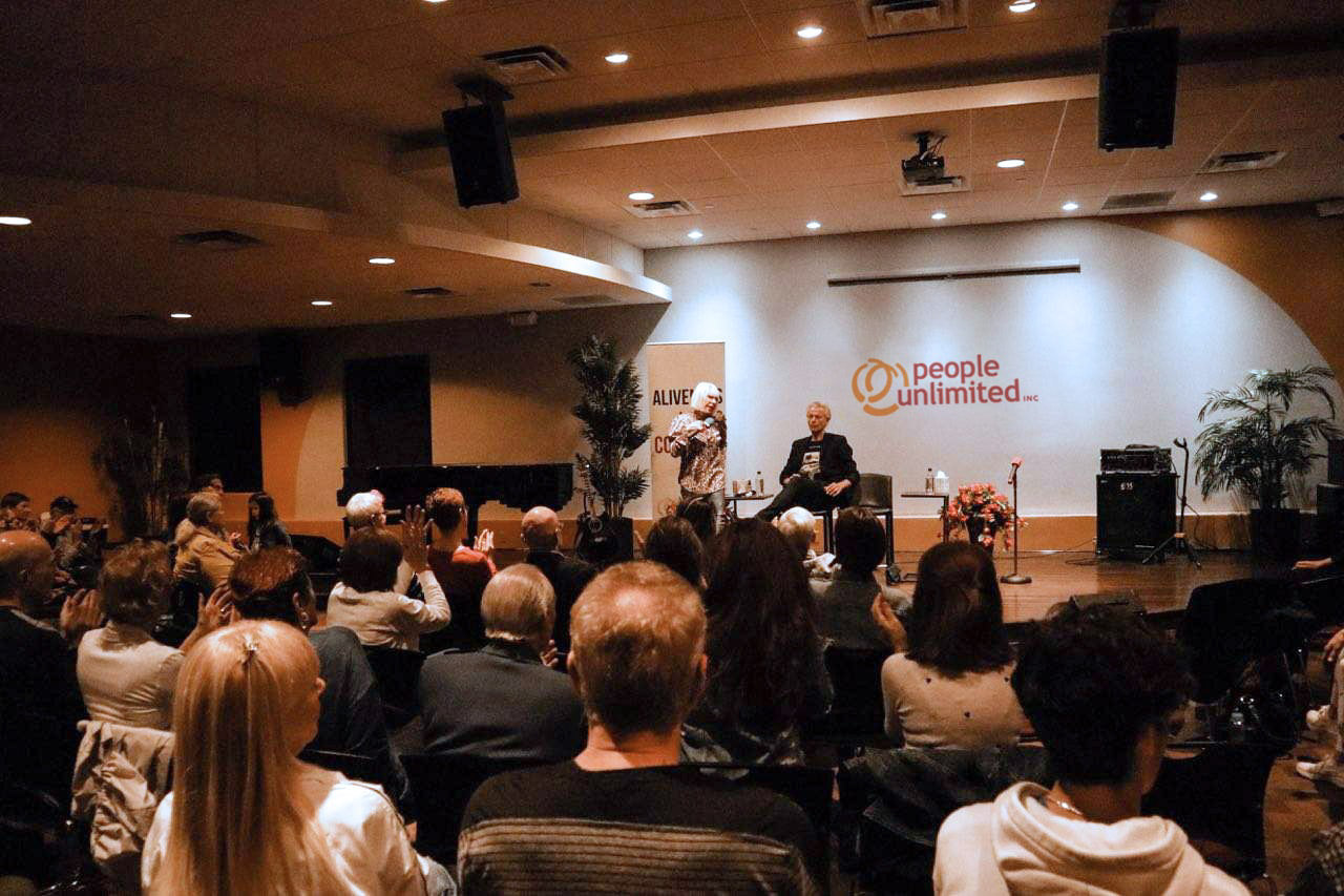
I have worked with People Unlimited for many years, and created several collateral images for them. These include two different murals for their Center, as well as banners, brochures, a book, magazines, flyers, stationery, and more. In each of these designs, I used a warm and energetic color palate to highlight the “alive” feeling and nature that is so central to this group’s identity.